It can be difficult to predict what furniture customers’ tastes will be each buying season. The color forecast might call for bright orange, but is that what people will really be buying? There may be some tried and true upholstery fabrics, but those can often end up looking tired and dated after several seasons as well.
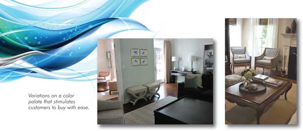
Working with clients year after year, and season after season, I have found that there is a color palette that has a very broad appeal, stimulates clients to buy with ease, and always looks current. It’s a color solution that is a non-threatening starting point for customers, and easy for retail sales associates who may not have extensive interior design credentials. Are you ready for it?
You must start with neutrals ranging from off-white to beige, and then add pieces in medium blue tones. Once this neutral and blue scheme is in place, you can accent with brighter colors and deeper shades. Let’s explore this palette in more detail.
THE DESIGN BASICS
When putting together your beige and blue seating arrangement, you could suggest that your customer pick a sofa fabric that is either a deep beige or a grey blue. Then match their chairs’ fabric in the other color for contrast. Table finishes, small accent pieces, like poufs, or pillows should be done in lighter off-white to set the two medium tones off from one another. You can also add rich cognac leather pieces to the mix for a warmer, updated traditional look. If you want the setting to have a more modern feel, add charcoal grey leather pieces instead.
You can easily add wood, metals, mirror, ceramic, bone or shell finishes that are neutral into this basic color palette for more interest. Gold and silver tones should both work well with these colors too.
If you can select a wall color, you should opt for pale versions of the beige or blue, or stick with a warm white. Try to avoid brighter background colors or muddy brown colors. They will not show off the pieces that well. Never use a yellow background either as it will make this color palette feel dated or a bit “off.”
If you display floor coverings in your vignettes, go for something with a neutral base that has some texture or pattern to it. You can include blue patterns here if you wish.
ACCENT COLORS
Brightly colored furniture settings can entice customers and catch their attention. However, when it comes to purchasing, those same bright colors can hinder your customers’ buying decisions because they may not be able to visualize pieces in different fabrics and finishes. Bright colors can also make customers question whether the pieces will actually reflect their style. The fact is that most bright colors tend to be trends that come and go with each season. This strategy shows you how to use brights more sparingly.
Once you have your base colors selected, you can have fun with small spots of brighter or deeper colors. You have many options here. I have done this color palette with orange and turquoise spots of color. I have also done jewel toned blues and purples. This color palette can look good with bright green accents as well, particularly if you have incorporated a lot of white in the scheme.
Pick just one accent color if you struggle with pulling colors together. Never use more than two. Remember that a little bit of bright color will go a LONG way! There is no reason to do too many pieces in your accent color. That can look contrived. Look for wall art that uses the accent color in combination with the beige and blue tones. Find small ceramic pieces that show off bright colors, and definitely add throw pillows in your accent colors.
WHY THIS WORKS
There are several reasons why I call this scheme a “no fail.” First, every season furniture manufacturers come out with new shades of neutral, beige fabrics. There is a reason for this! People like them and will buy them! New textures and slight variations in shade are the elements that keep pieces feeling fresh and new. You can keep experimenting with new combinations on this scheme.
Second, people today live very fast paced lives that are filled with over-stimulation. Interior spaces should create a feeling of calm by drawing on motifs that feel natural. Beige neutrals, white, and blue tones are all very natural in feeling. They bring to mind earth, wood, sky and water which appeals to people instinctively.
Finally, these colors always feel modern and updated because they are sophisticated. They are not bright, but they are not muddy either. The bright accents will make the whole thing feel more modern and will still add the eye-catching element that is needed for a retail display.
Try using this palette in at least one of your displays each season and see the results!
Designer Uma Stewart has gained a following for her signature approach to interior design. Coined “low-key luxury for the cultured life,” this style captures the modern desire to live both the good life, as well as a life less ordinary. Every project is guided by a fundamental vision of light, space and clean lines.
Uma founded Furbish Home in 2006 to offer an inspiring showroom environment to the public, while continuing to work on a broad range of design projects with individual clients. In 2010 Uma launched an eponymous boutique firm, Uma Stewart Interior Design, offering the highest level of creativity and service to her growing design clientele.
Uma’s design work and showroom have been featured in New Jersey Monthly, New Jersey Life, Domino, New Jersey Jewish News, and Millburn Short Hills Magazine. Uma’s design blog, the Furbish Notes, is widely read by design enthusiasts and professionals alike. In it Uma explores everything design, but also weighs in on the other passions in her life: writing, family, travel, art and photography, food and wine and more.
Before launching Uma Stewart Interior Design and Furbish Home, Uma worked as an acquisitions editor in book publishing and as a photo editor for a women’s fashion magazine. She studied design at Parsons and NYU, and has done graduate work in communications and culture. For more information on this article or other aspects of interior design contact her care of editor@furninfo.com.