The 2013 forty-first Toronto Canadian Home Furnishings Market was a whole new world, this year focused on the alchemy of color. The Market’s doyen, Jean-Francois Michaud, lives and breathes at the command centre of the Quebec Furniture Manufacturers’ Association, his reach extending to both national and international trends. To say that interest in the power of color is global could be an understatement! Canadian astronaut, Chris Hadfield, newest resident orbiting in the International Space Station for the next several months, said he was “dazzled by the ever changing kaleidoscope surrounding Planet Earth. This morning over Africa, my breath was taken away. Unbelievable richness of color and texture. It was a spiritual experience!”
So, color top of his mind, Michaud asked Guru Leatrice Eiseman to address Market attendees, and to work with world class designers Pierre D’Anjou and Andre Carron, and Janette Ewen, Canada’s own lifestyle and décor expert. They developed the Market’s color theme together, the D’Anjou/Carron duo skillfully continuing to orchestrate the popular Quality Canadian Furniture Trends Display, and Janette, masterminding her wise and whimsical Pop-Up Vignettes.
When people ask, “Why should I go to Market... any Market? I’ve got the Internet, newsletters, designer television, social media. Why take time away from business, spend the money for travel, the hotels/food?” The answers are manifold. The past 12 months have been full of experiences, good and bad. Sales results scoot up and down like a thermometer during any Canadian winter... or summer!
And with as little apparent reason, like the Dow or the TSX. But Markets are day-and-night essentials. Certainly to see and order new home furnishings. To connect with old friends and colleagues. We all need that face-to-face encounter, to reach out and touch – and sit on! - fabrics, leathers, woods and metals. And the principal incentive, more than any other factor, is to revitalize our thinking, maybe seek those far horizons out of our day-to-day comfort zones!
Lee’s vision reflects The Pantone View Home + Interiors 2013 Forecast. Her credentials, Lee is “America’s Color Specialist”, author of many books on the subject, founder and director of the Eiseman Center for Color Information and Training, and Executive Director of the Pantone Color Institute. She defined the 2013 theme as “Future Color Trends: and Realities”, and described nine palettes that were reflected dramatically in the Trend Display. Her rationale: “In order to create the ‘magic’ in the marketplace that ultimately leads to sales, colors for 2013 will need to coax and cajole, soothe or astonish, renew and replenish. At the same time, there will be the consumers’ expectation of practicality, what colors have staying power and can be relied upon as a steadying influence in unsteady times. Skillfully balanced color palettes that play to their practical side, while satisfying their aspirations, hopes and needs for something novel will remain key to enticing the would-be consumer or client.”
Eiseman’s visions are realized as “Connoisseur, Glamour, New Old School, Rugged Individuals, Extracts, Footprints, Sojourn, Surface Treatments and Out of the Ordinary”. When Pierre and Andre met to brainstorm the concepts’ development, a “small village” emerged, twelve separate “fantasies and realities” that were transformed into integral portraits of living spaces. “Not only color values but a different approach to the ‘architecture’ of the Display helped to make each of the vignettes even more accessible this year to visiting retailers. The individual exhibits, each with its own wooden structured arch, constitute 12 ‘homes’ within a small village. There is a wide variety of choice that will offer retailers, when creating their own displays, the highlights they need for their own vignettes.
“The visitors’ ‘wow’ response is not unusual, reactions have always been super, but the enthusiasm factor rose to great heights with the combination of mood, shapes and really vibrant pigments!”
Pierre and Andre revel in flights of fancy, but always with a practical application, to showcase quality furniture. Lee’s “Connoisseur” (#1) evolved in their hands as a wine drenched oases in a color-match* to Pantone’s Patrician Purple and Violet Quartz, an upmarket niche in a sophisticated living room. Palliser’s neutral-tone sofa and ottoman were anchored by two enormous cream-color vases, perhaps brimming with a lush Merlot? both conceptions of Le Present. Said Lee, “It’s a fresh approach to celebrating the finer things in life, displaying a sense of history and elegance.”
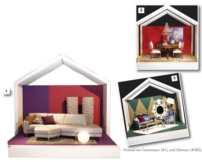
“Glamour”(#2) was presented twice. “Sleek and sensuous,” Lee told us, “very much reminiscent of the Art Deco era interpreted with contemporary influences.” Pantone’s Rio Red and Chinchilla accented Dinec’s chic dining room and Pierre found the perfect spark to pull the theme together, a 4’ x 4’ print of the “Deco Diva” Tamara de Lempicka’s signature painting “The Blue Scarf”, circa 1930. (Pierre added, “It’s important to look and find just the right accessory and place it in the right spot. The right objet or art brings everything together. It’s worth it to make the customer stop and look. It makes it possible for the customer to visualize how it would look in her/his own home. . and adds to the sale!” Another touch, the period chandelier, a Gen-Lite confection.
The second “Glamour” (#3) palette reflects the reprise of “the glimmer of a bygone age”, Continental Furniture’s curvy Ludovica loveseat, armchair and tables, the statement mirror and lighting by Gen-Lite. The backdrop with a geometric harlequin touch, stars chinchilla and jasper tones. And the disco ball, placed on the carpet next to the table; it belongs to Pierre, is one of his good luck charms! (“I’m taking it home after the Market!”)
“One of the biggest sources of excitement is the wide variety of choice offered in these collections, truly something for everyone,” said Andre.
“New Old School” (#4) is something else again! Somehow patriotic, somehow preppy, the color mix is sharp, “The hues found typically in iconic flags and banners,” said Lee. The bedroom and ottoman by Trica, the mattress by Zedbed, key paint shade Pantone’s TPX micro chip. A striking blend of tartan-like patterns and clean styling, this combination would act like a magnet in showrooms, particularly at special times on the calendar, but fresh and beckoning all year ‘round.
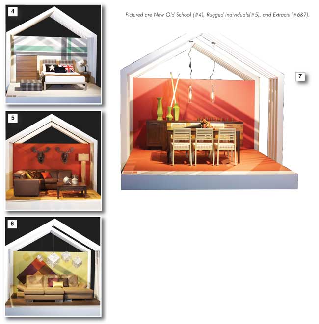
Pierre enjoyed introducing two engaging Le Present moose heads into the vignette Lee dubbed “Rugged Individuals” (#5). Lee spoke of the “earthiness of Raw Sienna blending with Vintage Indigo and Stonewash blue jeans.” The essence of the vignette, featuring a Jaymar sectional and BG Furniture’s occasional table, says Lee, “ranges from out west to the Outback, picking up along the way the ‘ole’ of the gaucho, cowboy and cowgirl, the natural shadings of the prairie and polished leather, weathered wood and animal hide”. Pierre’s moose heads add the necessary touch of whimsy that made the retailers viewing the vignette smile. A consumer winner, too!
“Extracts” (#6) is another Lee double-whammy, the spicy tones taken by Andre and Pierre to an enticing high with Gen-Lite’s sparkly cubes of light casting shadows on the dimensional backdrop (the shapes are cardboard, mounted on chrome) and the creamy sofa, enhanced with Pantone’s Green Banana and TPX Rain Drum. The Via Brooklyn sofa with its distinctive silver wrapped feet opens surprisingly to a comfortable bed. Lee’s color comments, “Flavourful notes of color along with suggestions of appealing scents create combinations that are restful, pleasing, piquant . . . a subtle taste implied in this palette evokes a somewhat exotic top note.”
“Extracts” two (#7), Canadel’s High Style dining room collection carries the same ambience, highlighted with shapely green vases by Zuo Modern, riding asymmetrically on double four-drawer buffet chests, each drawer in a different wood finish. Another Pierre surprise, the vases sport two neon tubes that create yet another shadow pattern on Pantone’s Spiced Coral wall.
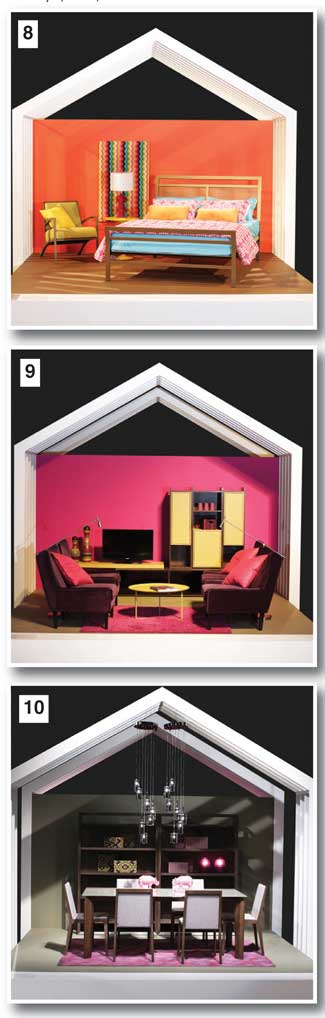
“Footprints” (#8 )was a real show stopper, a bedroom vignette far from tranquil! “Vibrant tribal colors”, a jolt for any not-quite-awake showroom shoppers! About the striking wall hanging; Pierre framed a dominant piece of textured fabric that reminded him of the Italian verve of Missoni, turquoise and orange, a complement to Pantone’s Tangerine Tango. The Billboard bed and Rome armchair, both by Amisco, and bedding by Textiles Gauvin are “bold, forthright and very directional”. The hot trend of 2013, “a seductive rhythm of tangerine, peacock blue, fiery pink flambé and a solar powered yellow, cooled by yellow-green Oasis”.
Another spectacular twosome holds hands in “Sojourn”(#9 & #10), settings that Lee describes as “a bit more magical and intricate in the compelling mixtures of a heady Syrah wine hue, purpled blackish plum, and fuchsia, green and grounded organics”. Romano’s velour Dakota armchairs and Huppe’s Lyrics entertainment unit are drawn together by Trica’s Tam Tam table. “A great marriage,” said Pierre, “and an invitation to your customer to sit and take possession!”
The “Sojourn” dining room has its own mystique, a series of twining in two Huppe bookcases/ wall units, two statement-making Gen-Lite chandeliers and another bit of great fun, two large pink rhinoceros ready for battle in the middle of the Huppe table! “The rhinoceros came from Home Sense; couldn’t resist them,” he chuckled.
“Surface Treatments”(#11), another beckoning bedroom, is emphatic about texture, both smooth and nubby, combined with “the liquid colors of ocean, sea and air”, an environmental meld with “a vegetal green”, as Lee says, “diverse but compatible”. Pierre found two arresting mirrors by Zuo Modern, and placed them diagonally against the backdrop. A.P. Industries Sekoya collection, headboard, high chest and bedside table, provided more texture in what Pierre described as a “marquetry look”. The Dutailier glider chair is a welcome place of repose. The bed linens, Textiles Gauvin, are a gorgeous blend of tropical seascapes.
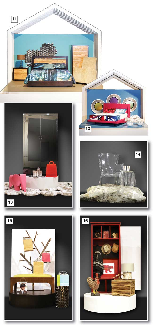
The twelfth vignette knocked the socks off viewing retailers... if they’d not already been loosened by the preceding 11! Lee called her color blend “Out of the Ordinary”(#12), and it certainly is. “Quirky, odd and whimsical, it captures the eye of the beholder, a creative array of colors.” Julien Beaudoin’s floating bed in the boldest fuchsia/red imaginable, commands the scene. Pierre filtered the glass of the three large wall-mounted mirrors; “I reduced the reflection and the colors became more subtle, an interesting touch”. The bed linens pick up both the reds and Lee’s “Bonnie Blue” in dramatic style. The crisp white vases and flowers by Le Present are the vignette’s exclamation point!
Scattered judiciously around and about the Market were Janette Ewen’s 2013 Pop-Up Vignettes with the look of clever photo-shoots. She said that, as before, they are designed to “give retailers, designers and decorators a fun, heady dose of inspiration when it comes to creating successful and memorable window and showroom displays.” Her tasty little tidbits had a different twist this year, in her words, “weaving a chic and exciting tale about Canadian style that extends from coast to coast.” Each Pop-Up is equipped with a brief explanatory commentary. (Retailers note. Your display will attract, the commentary will anchor them and expand buying horizons.)
Janette began her transcontinental safari on the West Coast, the inspiration drawn from Vancouver’s first downtown core, the once gritty “Gastown” (#13). Named after “Gassy” Jack Deighton, a seaman and barkeep, the area fell into disrepair following the Great Depression. Now Gastown has been reinvented as home to the city’s most trend-setting design stores, restaurants and bars. Janette focuses the consumers’ eye using, guess what? vivid color in Zuo accessories craftily reflected in the Plata Décor Shine Cabinet and the fluffy NCA Design Orbit rug.
“Old Montreal” (#14) in true romantic style, fashionable, authentic, quizzical, immerses your customer in the potential of displaying charm, elegance and chic, easily created in their home with your inventory! The transparent NCA Design Poltrona Chair and Plata webstool are perfect for tricking the eye in space-enhancing manner, floating on NCA’s Golden Circle Acid rug. Think of downsizers and their new age condos, disposing of family home clutter and acquiring new treasures. To quote Janette, “Not a place for the tacky!”
We’re still in Montreal with Janette’s “Sherbrooke Street”(#15), back in time the home of some of the largest mansions in the city, now a couture shopping and luxury gallery hot spot. The equivalent of Toronto’s Yorkville, the area is again chic as one would expect, high-end and the stamping ground of celebrities. Shopping bags galore (hint, hint, oh consumer!) hanging from the NCA tree in all their Zuo Lucite glory, perched on Plata Décor dream side table, framed by the Fitzrovia bench by Buhler.
The near north calls again (think Pierre and Andre’s moose heads back in the Trends Display!) “Muskoka” (#16) springs top of the mind for any Ontario (or wannabe!) shopper. (And how about the Adirondacks?) It’s been a favourite playground for more than a century and cottagers are always on the lookout for conversation pieces to brighten a dull corner. Certainly Janette’s zoo, (look for cousin moose, a bear, squirrel, fish and deer antler dotted about the Pop-Up), the woodsy lamp and table, and the functional Springwater Woodcraft locker could all find pride of place!
Now we’re off to the seaside, two east coast destinations. Surf’s up, and these vignettes put the customer right in the picture. And stops her/him in her/his favourite strip of sand! Instant reminiscence in mid- winter or anytime of the Maritimes many beaches. “Lawrencetown Beach, Nova Scotia” (#17) puts you in touch with some of the best surfing waves in all of Canada. Janette describes a relaxed life style, comfortable, worn, reflective of international sandy vibes with the spiritual quality of “the great wave”. Begin with a dominating transcendent backdrop (here from In2Walls) and furnish your favourite customers’ dreams with Style in Form’s Tulum chair, the white shag rug, the Lumitonic lamp and the blue and white Merben throw.
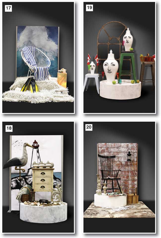
“Peggy’s Cove” (#18) is a depiction of a small rural community remembered for its famous lighthouse. If your clients are looking for laid back, rustic, weather beaten appeal, this Pop-Up in your store would inform them of your empathy. Furnished with the Amelia accent table, sculptures by Plum, the Merben fringed throw and Dudson soup bowls ... plus beach flotsam and jetsam.
President Obama chose to visit Ottawa’s “ByWard Market” (#19) on his inaugural trip to Canada during his first term in office. ByWard is the nation’s longest running farmers’ market with a history that spans almost 200 years. Architecture and design range from Queen Anne through Art Deco and the area is now home to many fashion boutiques. Raw steel Union Stools and the theme-happy Ludovic mirror frame the evocative NCA vases. Note the apples and wine/juices and consider inviting your customers to partake! Obama sampled fruit and coffee at ByWard, and bought cookies to take home to his daughters!
In 1792, “Niagara-on-the-Lake” (#20) was the first capital of Upper Canada, located where the Niagara River meets Lake Ontario. Ottawa eventually stole the title, but the town retains much of the feeling of former days with the Apothecary, the Town Hall (now a theatre amongst several others scattered about the quaint streets), the Fort and the more modern attractions of its many wineries. Surround this Pop-Up with the new trend of older styling, a vintage corner of your showroom. Nostalgia is huge in 2013 and Camien’s Royal Fan Back Arm Chair echoes the trend.
Think the wild west tamed just a bit at picturesque “Banff, Alberta”(#21), a mountain community best known for its beauty, turn of the century Banff Springs Hotel and magnificent, jet set spa, and a plethora of tourist-attracting sports opportunities framed by the Canadian Rocky’s. Janette wants you to remind your customers of luxury which they can replicate in their own homes, the Mobitol Zoom chair, natural walnut base with white top grain leather, the lavish Starlight Décor mink natural fur throw (100 per cent recycled, of course!) and the Style in Form wood block side table.
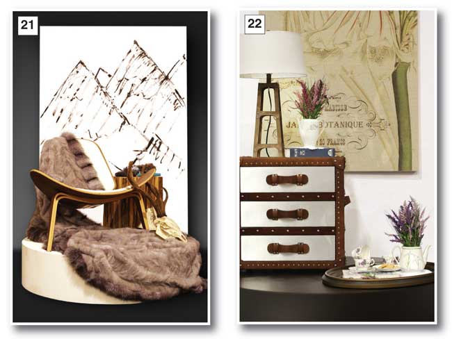
A bit further west “Victoria, British Columbia” (#22), island capitol of the province, has been the home (and still is!) of many top flight artists and artisans, in the last century the legendary Emily Carr with her affinity to the haunting forests and Haida native peoples. Historically fascinating, perched at the continent’s Pacific Rim, there is a large Asian population that adds its exotic top notes now in the Year of the Snake. More romance to exploit in your showrooms, not difficult to achieve. A show stopping Jardin Tapestry to back your own Pop-Up, a bronze Deco-Forme mirror in sync with the Gen-Lite lamp, metal based in rust and a CDI International Metal Trunk Cube chest... makes one think of a slow boat to China!
Another top tourist (and business!) destination, “Calgary, Alberta” (#23), famous for the annual Calgary Stampede and regional oil sands, turns everyone into cowboys and girls. At least in their imaginations, persuaded by Janette’s choice of the evocative Tapestries’ horse and script, and mirror-image Plum Horace horse occupying Zuo’s Haxby Coffee Table, great kickers for many themes. (As are the handsome boots!) In showrooms, a perfect accent visual to accompany studded leather settings.
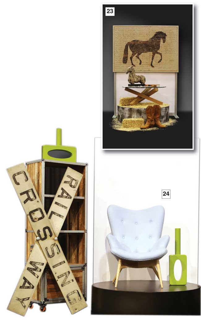
And Janette’s “The Junction” (#24) in Toronto, Canada’s largest city, replicates New York’s Williamsburg Brooklyn district demographically, as an arts community and a growing up-market centre. The Junction is the new home of galleries and cool vintage stores mixed with shabby chic and turn of the century shops and houses. From this has grown an industrial look, metal work, brick, rustic touches and, surprise! pure classic contemporary nuances. Think of some of your loft people, certainly the art crowd and some imaginative boomer folk.
Keep in mind, always, your customers’ ethos. Now, 2013, they are ultra-busy, distracted, bombarded with messages, some confusing, even bewildering. You need to help them focus, develop their own lifestyle conclusions . . . and actually enjoy the process!
Market magic is capable of sprinkling fairy dust, all the way to the bank!
*Pantone® is the property of Pantone LLC. The paint colors displayed are not a perfect match to Pantone identified standards. Pantone recommends that you consult current PANTONE FASHION + HOME publications for accurate color. Color-matched Benjamin Moore paints were used throughout the vignettes by the designers.
Gen-Lite lighting and mirrors were shown in most vignettes as were accessories by Le Present. Bedding by Textiles Gauvin.
Janet Holt-Johnstone is retail editor at Furniture World Magazine.