Savvy exterior facelift gives New England retailer a new look without giant renovation costs.
Back in the '70s, it was a structure that had no problem at all attracting attention. New, and more than the size of a football field, the Alperts Furniture Warehouse and Showroom stood all alone facing Interstate 95 in an undeveloped section of Seekonk, MA, just a few miles outside of Providence, RI. The building was difficult not to notice, and that was very good for business.
But as they say, "location, location, location"... and some twenty years later the isolated spot that the Alpert Brothers had chosen was now crowded with lots of "me-too," attention grabbing, big commercial buildings. And what once had been a virtual shrine was not looking any better for wear, if anyone was looking at it at all. This was not good for business.
So the company's president and chief executive officer, Mr. Hershel Alpert, decided it was time to give his store a make-over. The problem: How to take a large monolithic structure and, without extensive renovation, make it stand out in a crowd of similarly large monolithic structures?
"The original exterior paint was pre-baked to the corrugated steel frame and had never been re-coated. It held up well for quite some time, but within the past few years had started to chalk. By 1995 it was definitely in need of repainting."
New, Mr. Alpert is clearly an astute furniture retailer (former Brand Name Foundation's "Retailer of the Year."). And he apparently has a good feel for commercial real estate. But he decided to leave exterior design to an expert.
"I'd known Mr. Alpert for several years as a businessman in the community," notes Malcolm Greer of Malcolm Grear Designers, Inc., Providence, Rhode Island. When he called us in on the project, his goal was to raise the public's awareness of the quality of their furniture, while at the same time making the building more visible without looking so much like a furniture warehouse. And this was to be accomplished basically by re-painting the building... no major structural changes."
The task sounded Olympian, but Grear was ready for it. After all, his design firm had been one of five selected from hundreds across the U.S. to be a part of the 'Look of the Games' design team for the 1996 Centennial Olympic Games.
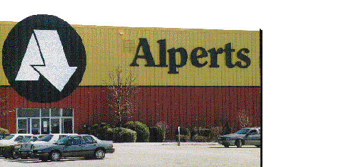
"The building was just a square block, like all the other buildings near it, and what we did was to add a horizontal strip to break up the large surfaces." This solid stripe creates the illusion of a two-story building.
And Grear took it one step further. By adding a small (18" wide by 16' long) section of wall to the upper side walls at the front of the store, he created the appearance that the top part actually overhangs the lower part.
Another design factor to be considered was that the Alperts Furniture Warehouse sits up high against what is often a bright blue sky for a backdrop. Choosing the proper paint colors to contrast against the azure was critical.
"We needed a color that would make the building 'pop' from the blue sky," notes Mr. Alpert, "and it surprised us when Malcolm Grear Designers picked a gold tone for the top half and an earth tone for the bottom.
"It wasn't what we had visualized doing, but when we questioned the designers about the brightness of the colors, they really stuck by their guns. They insisted it was the right way to go.
"I'm glad they did, because it really worked out. We have received a lot of compliments on the colors. We wanted the building to stand out, but in a way the customers would find pleasing, and that has been the case."
Notes Grear, the designer: "It's our job to make intangible things tangible, to help the client conceive our vision."
With the new color scheme decided upon, it was now a matter of selecting the brand of paint. Ability to match Grear's colors was important, but the client was also concerned about the cost over the long haul.
Normally, the most expensive part of a paint job is the labor of applying it," notes Mr. Alpert. "If you're going to spend that money anyway, you might as well go with the best product that's out there."
After extensive research, Alpert decided to go with Du Pont's IMRON® 333, a high gloss, polyurethane coating... for a number of reasons. And they contacted Boyd Coatings Research in Hudson, Massachusetts, a distributor of Du Pont paint products, to match the designer colors.
According to Boyd division manager Joe MacPhee: "It provides good coverage, high gloss and 'hiding'. This was important because the old coating on the building had dark vertical stripes. The 333 did a good job of hiding the stripes and so less paint was used... about 300 gallons, completed by a five man crew in three weeks.
"We went with an IMRON® coating," recalls Alpert, "for its longevity and the ability to retain its depth of color and its sheen. After all, we're in the Northeast, we have snow, we have wind, we have sun."
MacPhee concurs: Its biggest benefit is that it keeps its color and its gloss longer then about any other type of paint. It won't fade or chalk for 10 to 15 years, while most oil-based paints will start to fade much sooner. When its dry, IMRON® is basically a piece of plastic, so it's flexible. And since the Alpert building is metal, temperature changes will cause the building to expand and contract. A very hard paint like an epoxy, would crack and eventually start to peel off."