Part 1: Retail Renovation Strategies For Small, Medium & Large Investments.
Store Design Magic By Martin Roberts
When we look at retail renovation strategies, it’s easy to become overwhelmed. How much do you need to invest? Can small changes make a big difference? What are some quick steps you can take to refresh your store and give it some new energy? Are the most expensive renovation strategies necessarily the best?
A grand overhaul will almost always be effective, but you want to make sure you get the most bang for the buck. Times are tough, and perhaps you realize that you need to make some changes to your store to differentiate yourself and bring your look up to date in order to survive, but you don’t have a big budget to work with. Or perhaps, like many, you’re somewhere in the middle: you know you want to devote significant resources to a renovation, but you want to keep costs down. In this three-part series, we’ll explore what small, medium and large investments in renovation strategies will yield, looking at specific examples from each category.
Barbados-based Dwellings is a small retailer with one 10,000-square foot store in a warehouse location not devoted to retail. They needed to create a name, brand, identity and store design that would make them a destination store — and because they were just starting out, they needed to implement it all on a very small budget.
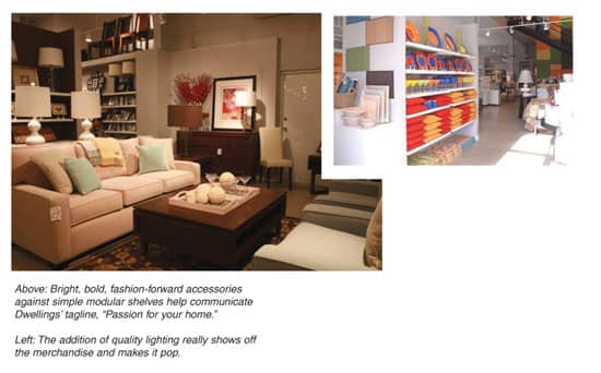
The first step was for Dwellings owner Louis Carrilo to determine what he was trying to achieve, and what the store’s brand identity would be. The name Dwellings evokes a sense of both home and leisure, and the tagline “Passion for your home” promised that the store would deliver quality merchandise with bold, fashion-forward looks. The logo further emphasizes this message with a sophisticated, clean-lined font.
With a wide range of merchandise, including glasses, barware, tabletop, decorative accessories, kitchen products, small appliances, pillows, linens and furniture, the store needed to be configured in a way that allowed the merchandise to really pop, and was also flexible enough to be moved around quite frequently as seasons changed.
The design process began by sketching designs for the store layout, always keeping the budget in mind. A sleek, minimalist design was created with modular shelving that allows for both beautiful product display and the flexibility to create new displays often, keeping the store’s look fresh and exciting, which keeps customers coming back to see what’s new.
The floor was kept concrete, which both adds to the modern aesthetic and costs very little. Very few fixtures were added. Everything was kept simple, with sheet rock walls painted a pristine white, the ceiling a simple creamy white, and a few accent walls painted in bold, striking colors. Painting is one of the simplest and least expensive ways to give your store a fresh look, and accent walls in bold hues can be changed with the seasons to add new flavor depending on the time of year.
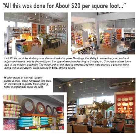
White, modular shelving in a standardized size gives Dwellings the ability to move things around and adjust to different heights depending on the type of merchandise they’re bringing in, and hidden tracks were installed in the walls for a crisp, clean hardware-free look. All the shelves are of a standardized size, so they can easily be moved from place to place and accommodate different sized merchandise perfectly.
The cash register area echoes this look, built inexpensively with particleboard and white PVC and concrete tops, which are durable and modern looking, yet inexpensive.
 If
If
If there’s one thing not to scrimp on, it’s the addition of quality lighting that will really show off the merchandise and make it pop. After all, no matter how beautiful your products may be, if the customer can’t see the texture, or if the color looks washed out in a fluorescent haze, you simply won’t get the sales you deserve. On the other hand, if things are well-lit and basked in a warm glow, and light is reflected off of glass and metal accents, it creates an upbeat atmosphere that results in higher sales. Dwellings, started with a simple ceiling painted in a creamy white. Lights were suspended from tracks to provide ambient lighting as well as the ability to spotlight different areas of the store.
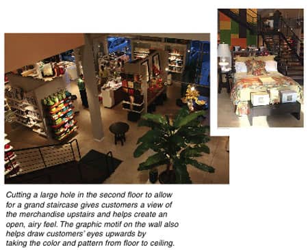
Dwellings was working with a location that was two floors, which is always a challenge at retail. Cutting a large hole in the second floor to allow for a grand staircase and a view of the merchandise upstairs gave the store less room for products on the second floor, but helped lure customers up to have a look. A wall that runs behind the grand staircase was painted inexpensively with a graphic motif that also helps draw customers’ eyes upwards by taking the color and pattern from floor to ceiling. Opening the second floor also helps create an open, airy feel throughout the store.
But with all this stark, clean store design, it becomes crucial that display is done right. Dwellings commissioned a professional designer to set up the store and make sure the merchandise pops; she now flies in eight times a year to change things for different seasons and sales. With a clean palette background, it’s vital that you change your display frequently to keep customers’ interest up and keep them coming back often to see what’s new.
All this was done for around $20 a square foot — a minimal investment. Dwellings was able to keep costs down by keeping floor and ceiling finishes simple, cutting down on fixtures, and really focusing on what was necessary for the product display. Opening up the second floor has meant higher sales and traffic, and the investment of a professional designer to change the display frequently keeps customer interest up. The renovated store was an immediate success, and within six months Dwellings’ management decided to invest in an expansion. They are now building a new children’s store across the way. The main store is pulling in about $350 a square foot — a terrific payoff for a minimal investment.
10 Small Steps For Simple Renovations
• Allow for flexible displays, so you can change the look of your store with the seasons.
• A simple stained concrete floor costs very little and is a great way to add to a sleek, modern look.
• Create a crisp, clean look with simple white painted walls, which will let your merchandise “pop.”
• Accent walls with a splash of color to create drama and excitement.
• Invest in quality lighting so that your merchandise and your store both look their best. Suspended track lights add to the modern aesthetic and ensure products are well lit.
• Cash register areas built from particleboard, white PVC and concrete tops are both aesthetically pleasing and practical in their durability.
• If you have a second floor, make sure customers can see it from below. Opening up a second floor may mean less space for merchandise to be displayed, but it ensures more customers will take the time to climb the stairs for a closer look.
• Paint a simple graphic motif from floor to ceiling to carry customers’ eyes upward and add a splash of color and texture.
• Hidden tracks in the walls make your display areas look clean and professional, and create flexibility.
• Commission a professional display person to regularly change your store display based on seasonality and sales to keep customers coming back to see what’s new.
Martin Roberts is an internationally acclaimed design industry veteran, with over 40 years of credits for retail and product design. With his staff of brand strategists, retail planners, art directors, graphic designers, web designers, environmental and industrial designers, Roberts leads his firm in interpreting brand DNA to the target consumer. The results can lead to increased customer loyalty and improved sales. GRID2’s projects with Borders, American Leather, TUMI, and Pathmark, are only a few examples of the success of Roberts’ tenets to empower customers to buy more, more often.
Roberts’ previous works included such nationally and internationally renowned corporations and brands as Bank of Boston, Barnes & Noble, Cartier, Chase Manhattan Bank, Coach, Duty-Free Shops, General Foods, Johnson & Johnson, K-Mart, Marriott International, Nestle, Perrier, Samsonite, Thomasville Furniture, Timberland, and Wal-Mart. With a BA in Industrial Design Engineering and an MA in Design Systems, Roberts has also served as an adjunct professor of Design Management at Parsons School of Design.
Questions on any aspect of retail branding or store design may be directed to him at mroberts@furninfo.com.